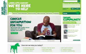
Cute & widely accessible website (though not for dogs)
We have discussed the developments of CSS3 and some of the quick and easy ways to make websites accessible to the visually impaired. The technologies and evolution of code outlined these last couple of postings are meant to introduce you to some of the considerations your organization should have as you decide to refresh or redo your online presence. Indeed, as we are teased with signs of spring (at least in the Chesapeake Bay region), why not enjoy some clean and spritely websites that follow some of the best practices outlined here?
Though completely Anglocentric, SmashingMagazine.com reviewed a number of charity sites in the UK notable for their good design and user accessibility. In this instance, the editors at SmashingMagazine (and we at MKCREATIVE Design) mean more than accessibility for the visually impaired, as mentioned yesterday. We mean accessibility of information and navigation. A website’s homepage should not be about a pretty (Flash) video meant to dazzle, but about the site, the organization it represents, and it should serve as a guide to all the great work your organization does.

The MacMillan Cancer Support Site (UK)
To pick on one example from the many nice ones, the folks at SmashingMag point to The MacMillan Cancer Support site in Britain. The clear navigation off the homepage is based on distinct tab shapes (themselves familiar to anyone who had a 3-ring binder at school or a Rolodex in their office). Moreover, the tabs and labels are color grouped with sharp contrasts between darks on lights and their reverse.
When navigation goes bad, or, worse, is incomprehensible, the most popular tag for it seems to be “Mystery Meat Navigation.” The term means the visitors have to take what is served them, but they do not know what it is or why it is being presented. Alas, a classic example of such mystery-meat navigation is Chipotle’s site, where images change without explanation, the logo is actually the menu, and the menu list to the right of the car is, well, nothing. I say ‘alas’ because I am a fan of the chain (and I speak with the authority of a born-and-bred Texan). The problem is ironic as well, given the product.
Much of web design is about clear expectations, goals, and parameters. And these issues are where the nonprofit and mission-based business need to get involved with their ambitions, yet be prepared to work with the limits of best practices and evolving code as they work with their design group to produce sites that stand out for all the right reasons. And that bring clients, donors, and customers back time and again in a meaningful exchange of ideas and development of professional relationships.
